Folwell Callouts News

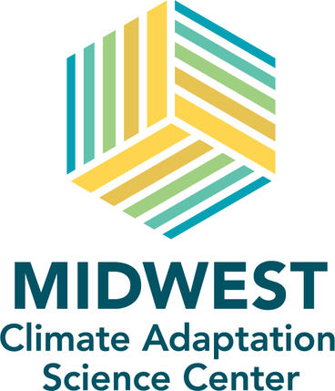
We are excited to introduce the Midwest Climate Adaptation Science Center (MW CASC) logo! The logo and related branding is grounded in our values, science priorities, and the geography of our region. It was developed in August 2022 by Midwest CASC staff and leadership with the design firm Woychick Design.
Colorful Geography
- Blue represents creeks, rivers, lakes, and Great Lakes.
- Green represents forests and prairie.
- Yellow/Orange represents cropland, climate, and warming temperatures.
Meaningful Form
- The stripes are inspired by climate stripes.
- The color gradient and different-sized stripes give the logo a sense of movement and hint at temperature changes and transition in the region.
- The gradient moves toward bright colors, representing both the ever-present impact of climate and our sense of optimism and resolve for a brighter future.
- The different colors, stripes, and sides fit together in a cube to represent collaboration, just as the many different partners come together to form the Midwest CASC.
Body
